Vivarium
Branding + Print Applications
Background
A study in the merging of mediums
Brief
Vivarium Festival examines the evolving relationship between nature and technology through a program of installations, performances, and discussions. This project explored the development of a cohesive visual identity that could unify the festival’s digital and physical promotional materials. By drawing on both organic and synthetic visual cues, the branding system reflects the tension and balance between the natural and the artificial, capturing the festival’s experimental and forward-thinking ethos.
Design Outcome
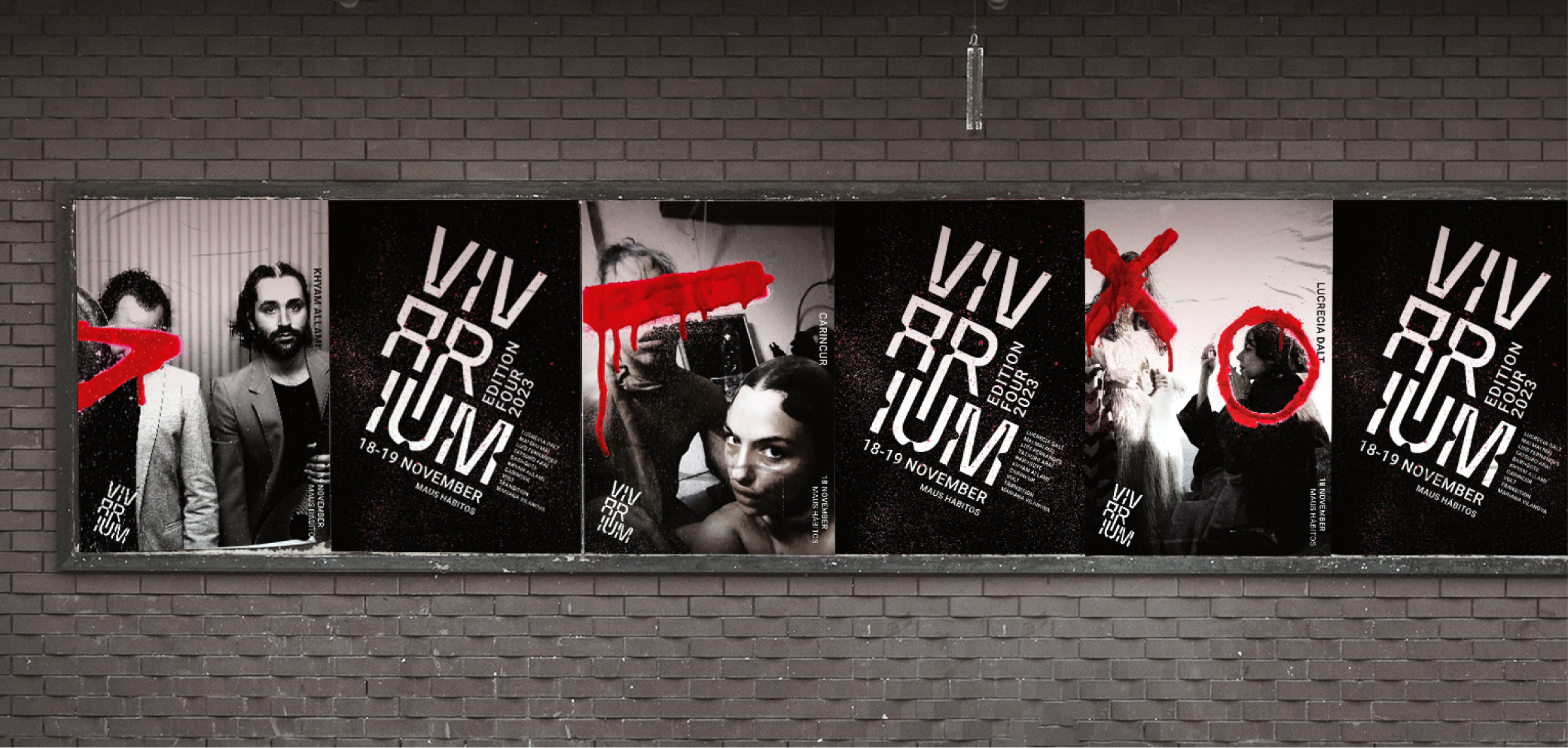
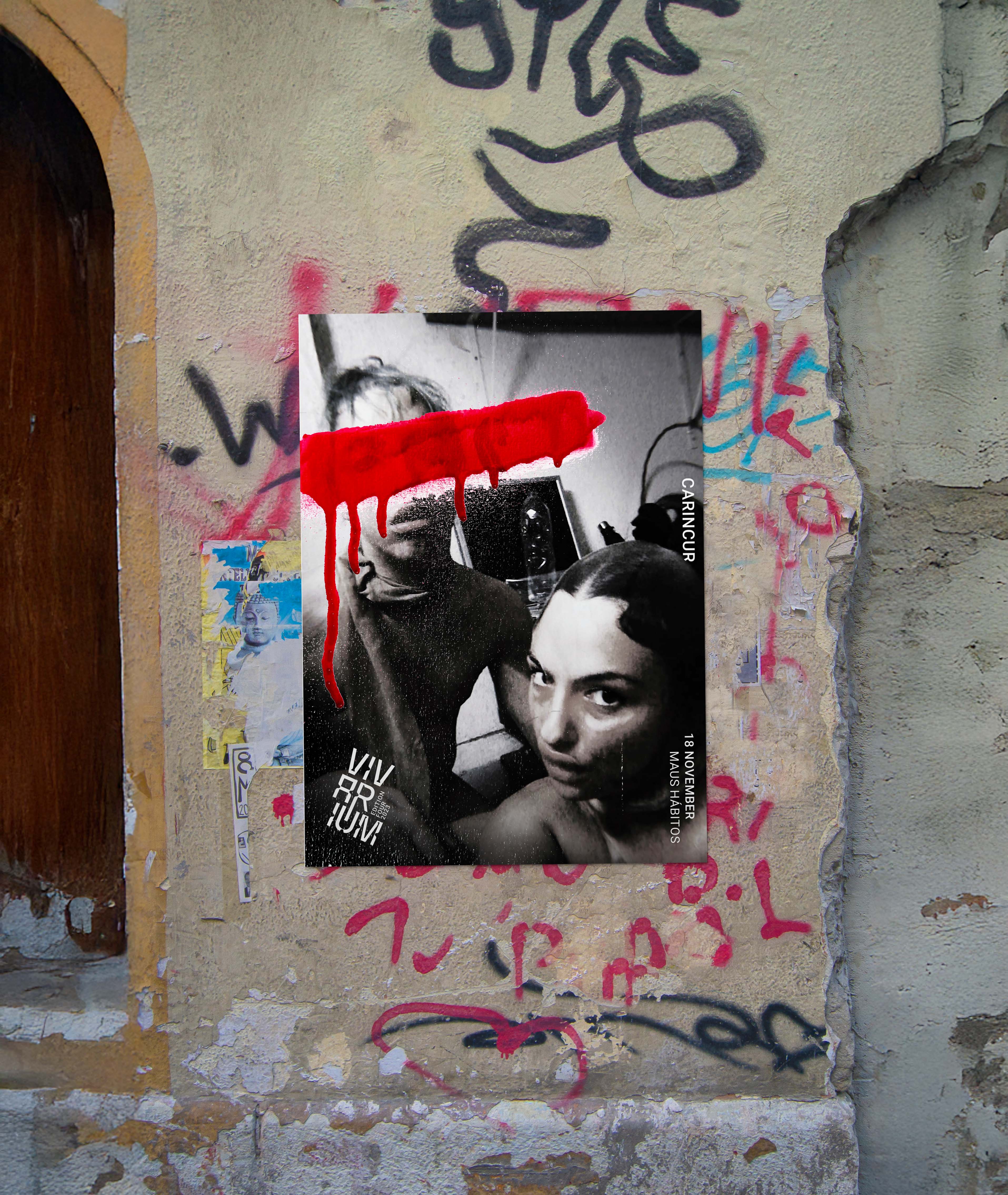
For the fourth edition of Vivarium, the visual direction was guided by the sub-theme ‘The Merging of Mediums.’ This concept explored the intersection of digital and hand-crafted techniques, combining refined digital forms with expressive, spray-painted additions. The resulting visual language reflects a deliberate blending of artistic approaches, creating a dynamic and tactile identity designed to engage audiences and reinforce the festival’s experimental nature.
Branding
Printed Media


The Vivarium logo employs the Kandel Latin typeface, customised with specific modifications to achieve a cohesive and distinctive visual identity. The deliberate, curved incisions in the letterforms echo the festival’s theme, symbolising the convergence of natural and artificial elements. The application of diagonal orientation introduces a sense of dynamic energy and movement, enhancing the logo's overall impact.


RELATED Projects


