
Red Seal
Branding + Packaging Applications

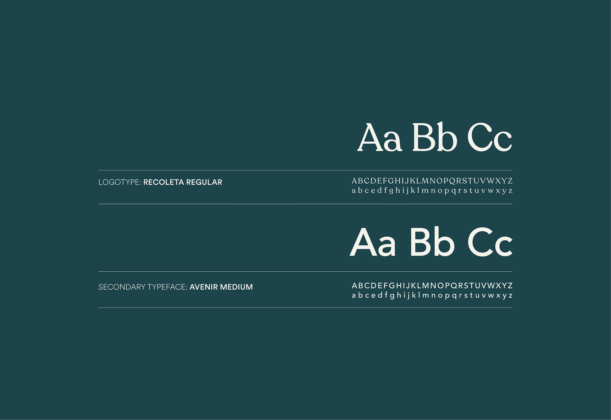
Background
A modern refresh of a heritage tea brand
Brief
NZ-based natural tea company Red Seal introduced a Hot-or-Cold product range with the intent of creating a tea that does not need to be ‘tied to the kettle.’ This project explored a contemporary refresh of the brand, examining how Red Seal’s visual identity could evolve through this range to better reflect modern lifestyles and consumption habits.
The refresh centred on modernising the brand’s visual language while staying true to its foundations in health, wellness, and natural ingredients. Particular attention was given to expressing Red Seal’s connection to the New Zealand landscape through colour, form, and tone, creating an identity that feels both grounded and contemporary. The result is a more flexible branding system designed to resonate with existing customers while appealing to a broader, lifestyle-focused audience.
The refresh centred on modernising the brand’s visual language while staying true to its foundations in health, wellness, and natural ingredients. Particular attention was given to expressing Red Seal’s connection to the New Zealand landscape through colour, form, and tone, creating an identity that feels both grounded and contemporary. The result is a more flexible branding system designed to resonate with existing customers while appealing to a broader, lifestyle-focused audience.
Design Outcome
My logo concept combines the literal meaning of the brand name with a considered visual interpretation. The mark was developed as a pictorial logo that brings together references to both a traditional wax seal and a seal (the animal), creating a distinctive symbol that feels recognisable yet contemporary.Building on this foundation, the wider brand refresh focused on reconnecting Red Seal with its natural origins. Native New Zealand plant forms were incorporated into the packaging design, supported by a refined colour palette that balances organic tones with vibrant accents. This approach allowed the brand to feel grounded and authentic, while remaining fresh and visually engaging across the Hot-or-Cold range.
Branding
Packaging

Drawing from the literal meaning of the brand name, this logo design is playful while also emphasising the established history of a brand that has been an industry leader for over a century. With a modernised and simplistic approach, this design refreshes the brand and provides an authentic feel that resonates with both long-time customers and new audiences. The blend of contemporary elements with a nod to the brand's rich heritage ensures a timeless and appealing visual identity.

RELATED Projects