
Home.Two
Branding + Print & Digital Applications
Background
Building a playful system for social impact, block by block
Brief
This project explored a branding refresh for Home.Two, one of the cafeterias operating under ForChange, a social enterprise dedicated to tackling youth homelessness. Home.Two is strategically located near the University of Melbourne and primarily serves the student community.
This rebranding initiative aimed not only to create a welcoming and vibrant space for students, but also fostered a sense of community engagement, aligning Home.Two’s identity with the broader mission of ForChange.
This rebranding initiative aimed not only to create a welcoming and vibrant space for students, but also fostered a sense of community engagement, aligning Home.Two’s identity with the broader mission of ForChange.
Design Outcome
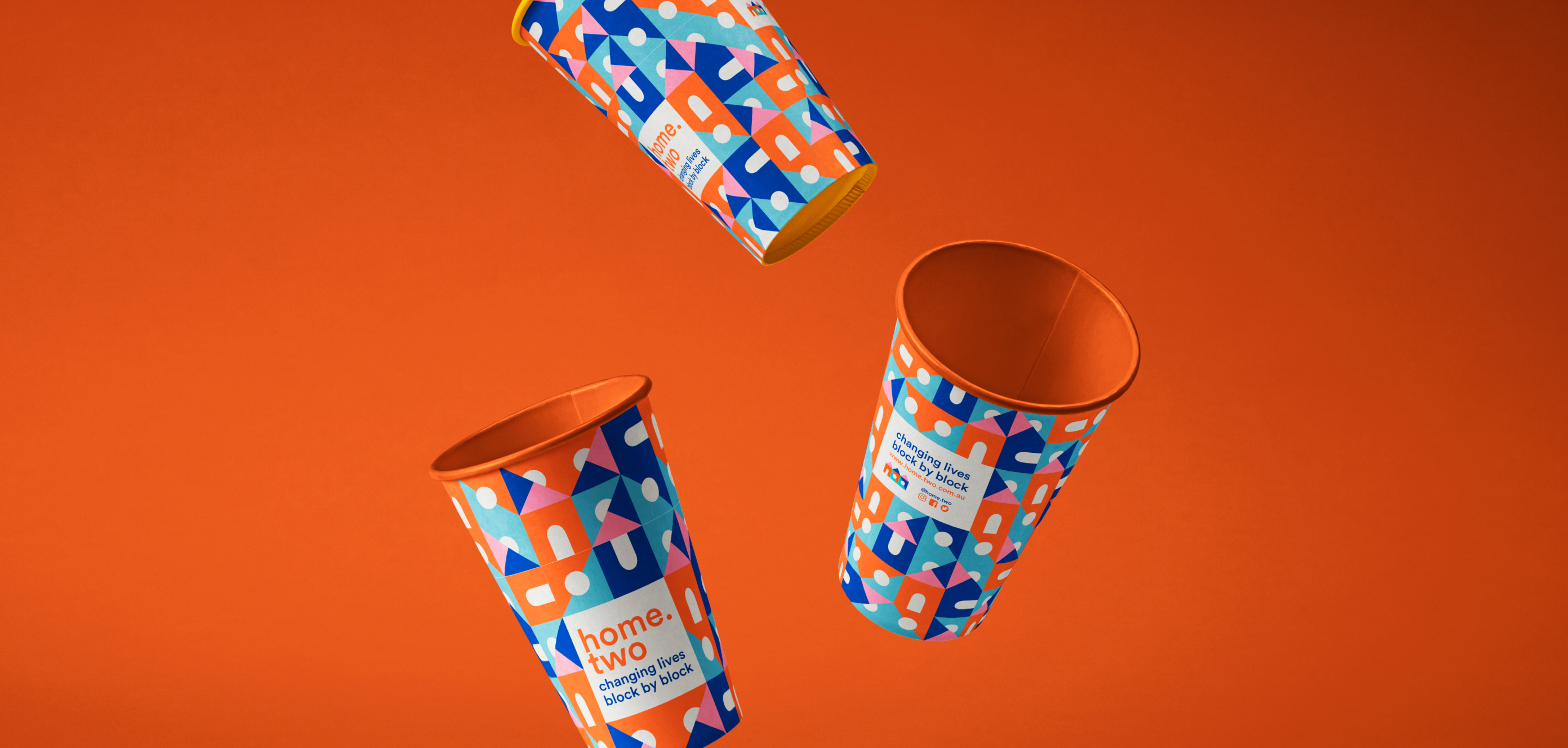
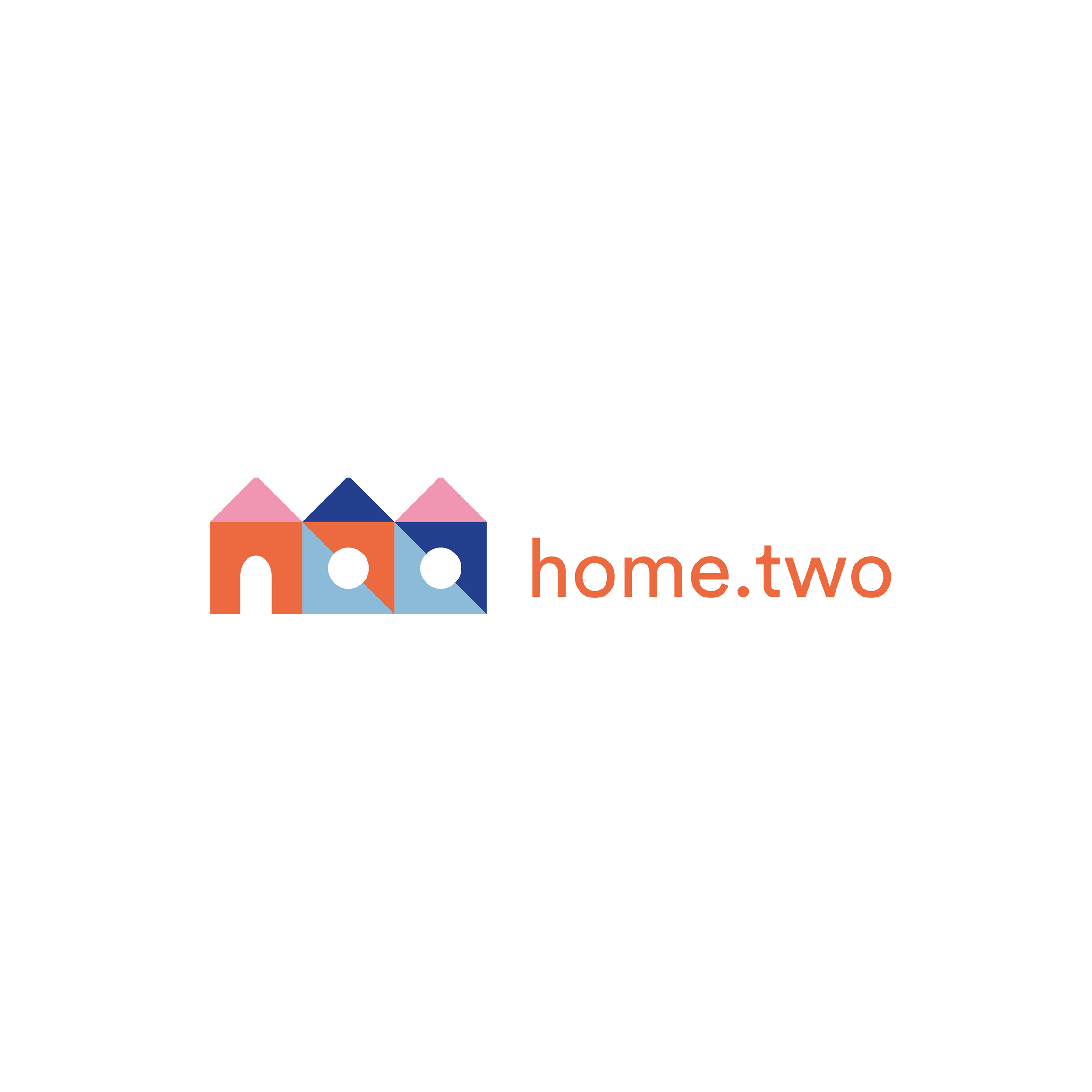
I centred my design concept for Home.Two’s logo, packaging, and overall visual style on the notion of stacked building blocks. This tessellation created a playful feel while forming a versatile and cohesive visual language that seamlessly extends from the physical ambience of the café to its online presence.
The building-block motif also acts as a metaphor for community - individual elements coming together to create something stronger - reflecting Home.Two’s role as both a social space and a place of community.
The building-block motif also acts as a metaphor for community - individual elements coming together to create something stronger - reflecting Home.Two’s role as both a social space and a place of community.
Branding
Printed Media
Social Media
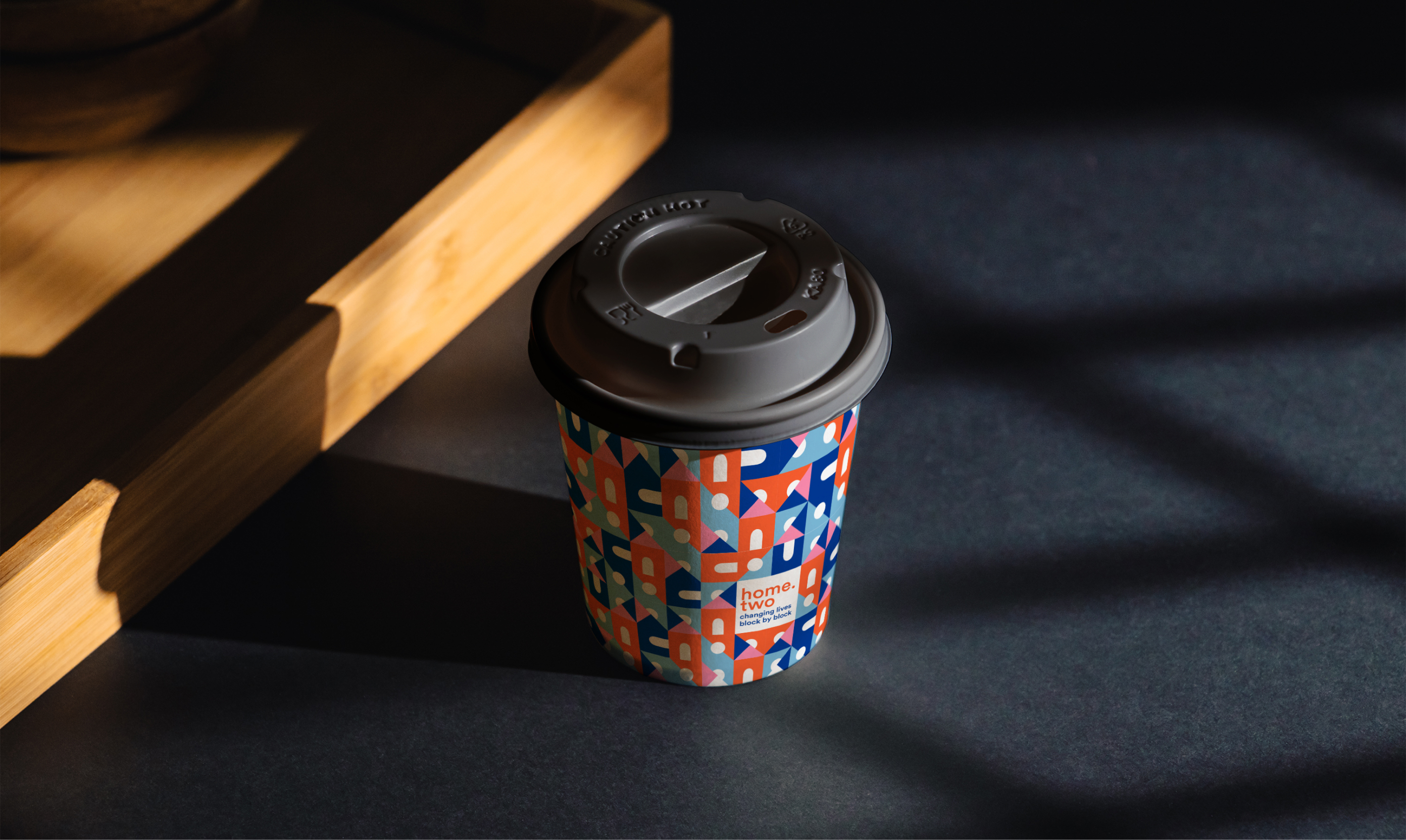
The building block pattern proved to be a highly versatile element within the identity system, easily adapting across both packaging and social media applications. Its modular structure allowed the pattern to be scaled, cropped, and rearranged, creating playful compositions while maintaining strong brand recognition. This flexibility enabled the brand to feel consistent yet dynamic, supporting engaging visual content across physical and digital touchpoints.


RELATED Projects


