Convenience Pulse
Website Design
Background
A credible platform for retail intelligence
Brief
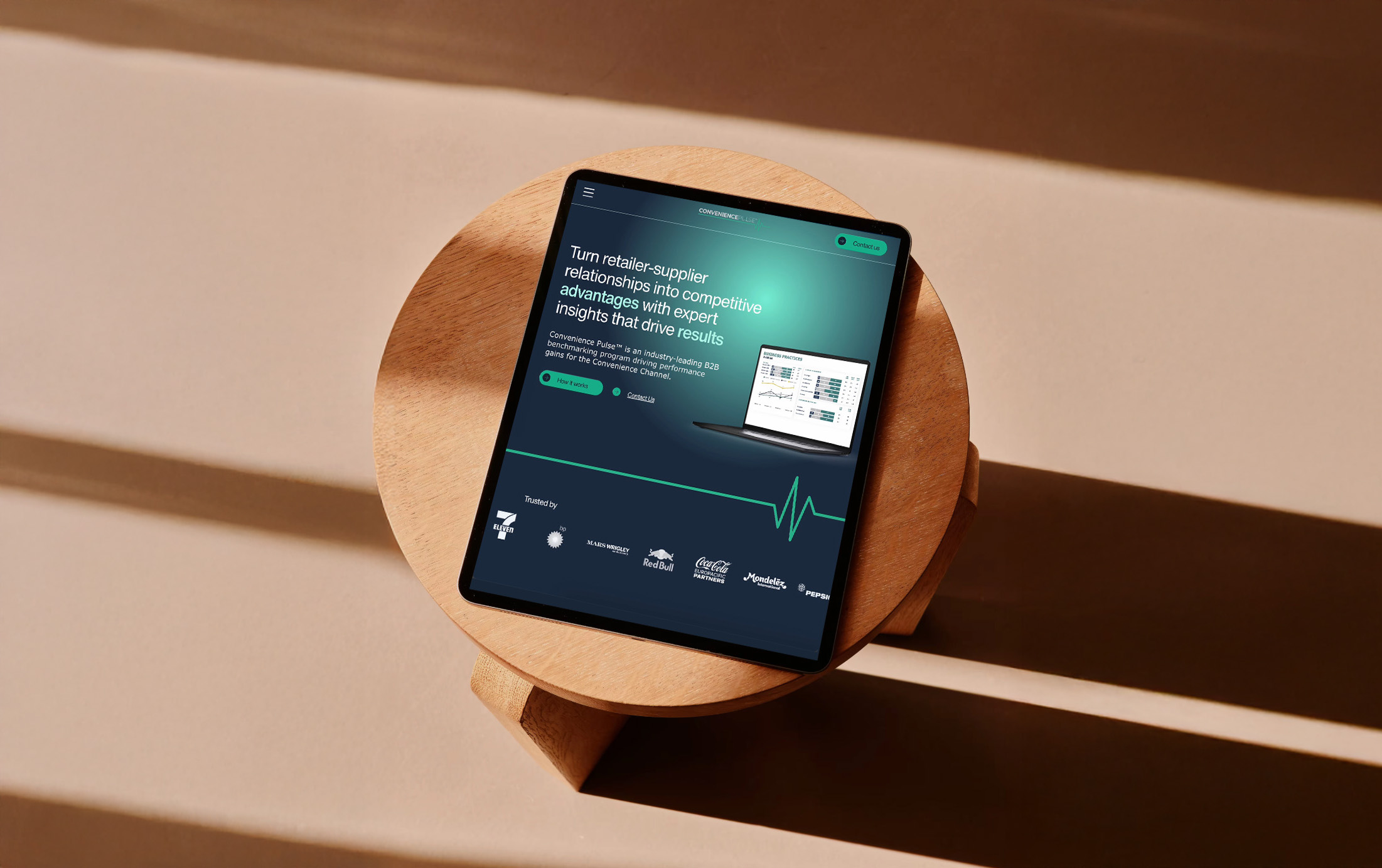
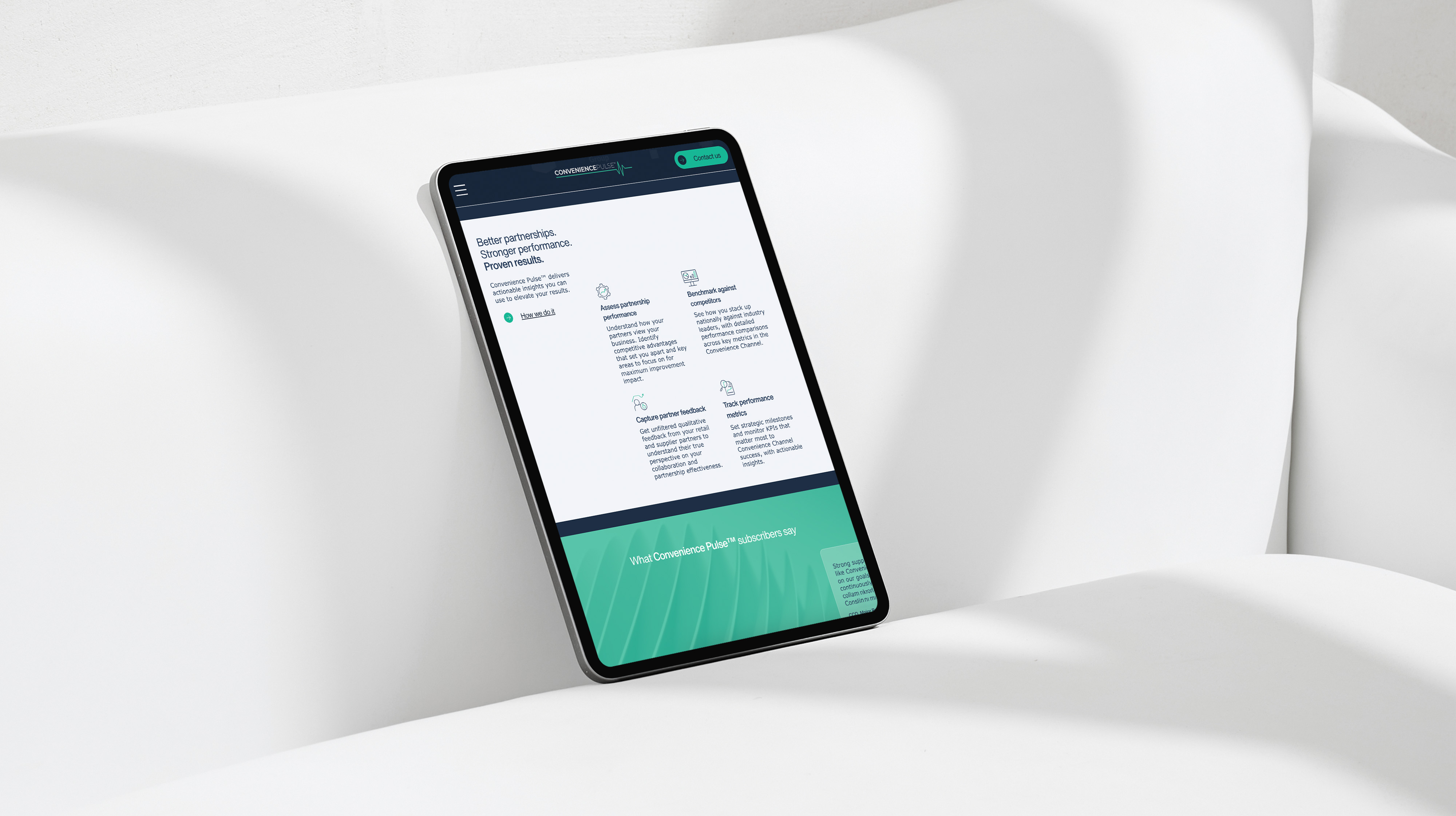
Working for Majella Studio, I was tasked with helping to design a digital presence for Convenience Pulse that positioned them as both an innovative and credible resource for convenience retailers in the U.S. market. As a team our goal was to create a site that felt professional yet approachable, while clearly showcasing the program’s methodology, reports, and actionable insights to potential retail participants.
Website
www.conveniencepulse.com
Design Outcome
I designed the home page layout and supported the website build in Wix Studio, focusing on delivering fresh, dynamic visuals with an equal focus on seamless navigation, responsive design and an intuitive user flow.
Through the entire design process, the aim was to champion Convenience Pulse’s existing bold colour palette and unique logo mark, yet lend the brand a sharper, more modern edge. The use of bold gradients paired with the heading text Helvetica Now established both a confident, credible tone that fitted with the site’s contemporary brand.
Through the entire design process, the aim was to champion Convenience Pulse’s existing bold colour palette and unique logo mark, yet lend the brand a sharper, more modern edge. The use of bold gradients paired with the heading text Helvetica Now established both a confident, credible tone that fitted with the site’s contemporary brand.
Work completed through Majella Studio.
Website Design

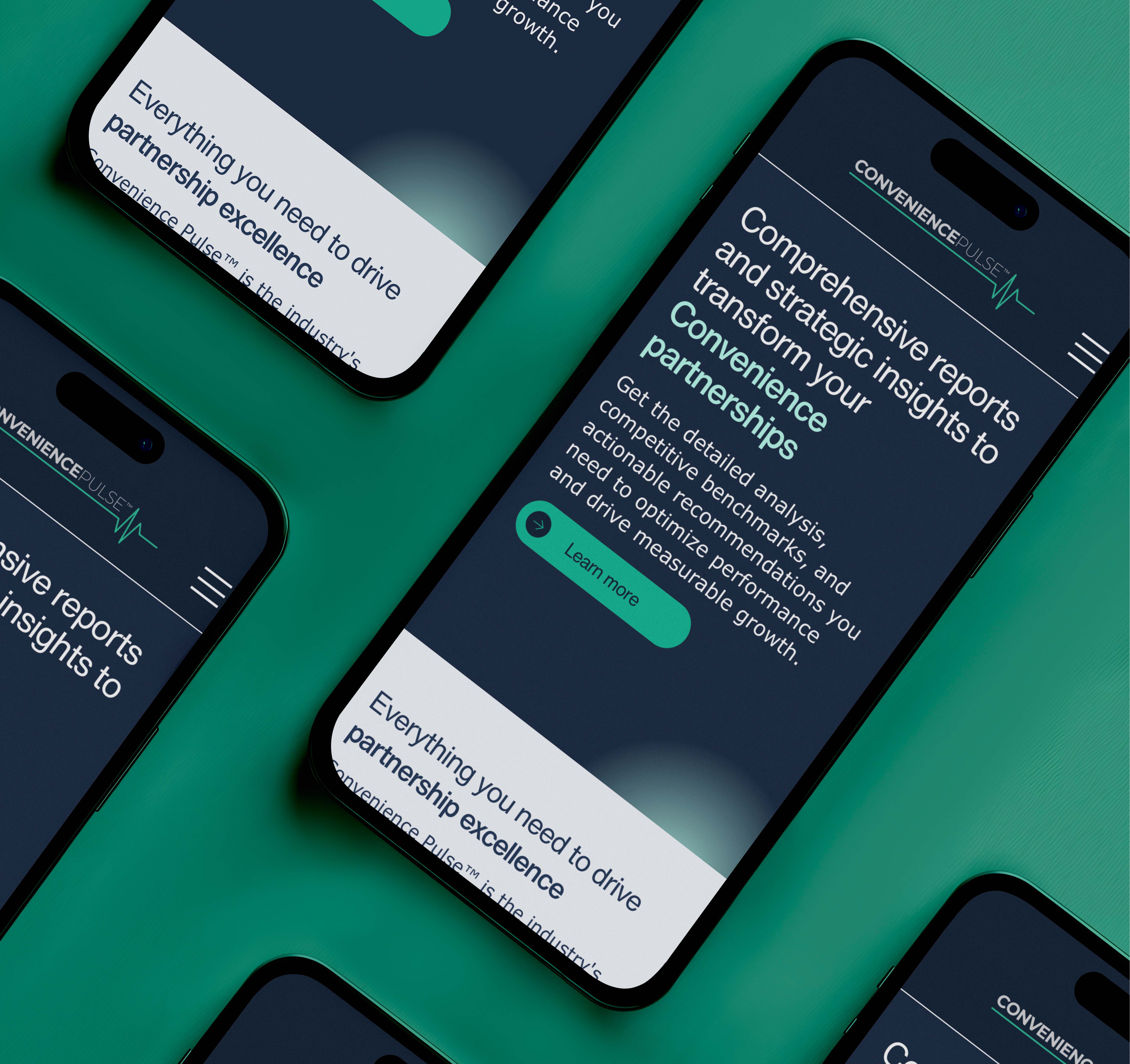
As a subtle nod to their platform name and brand identity, the pulse motif was highlighted through interactive animations. These provided the site a sense of energy and momentum, as well as underscoring the brand’s commitment to monitoring industry performance in the retail space.
RELATED Projects